To help support commonly requested embeds that are not allowed directly in blogs.clemson.edu sites due to network blog security settings, we’ve created three custom blocks for you to use. These restrictions are related to WordPress roles and capabilities (such as unfiltered_html), which limit iframe usage in standard editors. You can read a bit more about unfiltered_html permissions here: https://wordpress.org/documentation/article/roles-and-capabilities/#unfiltered_html
Let’s get to it!
You can find these blocks in the “Clemson Blocks” category within the block editor.
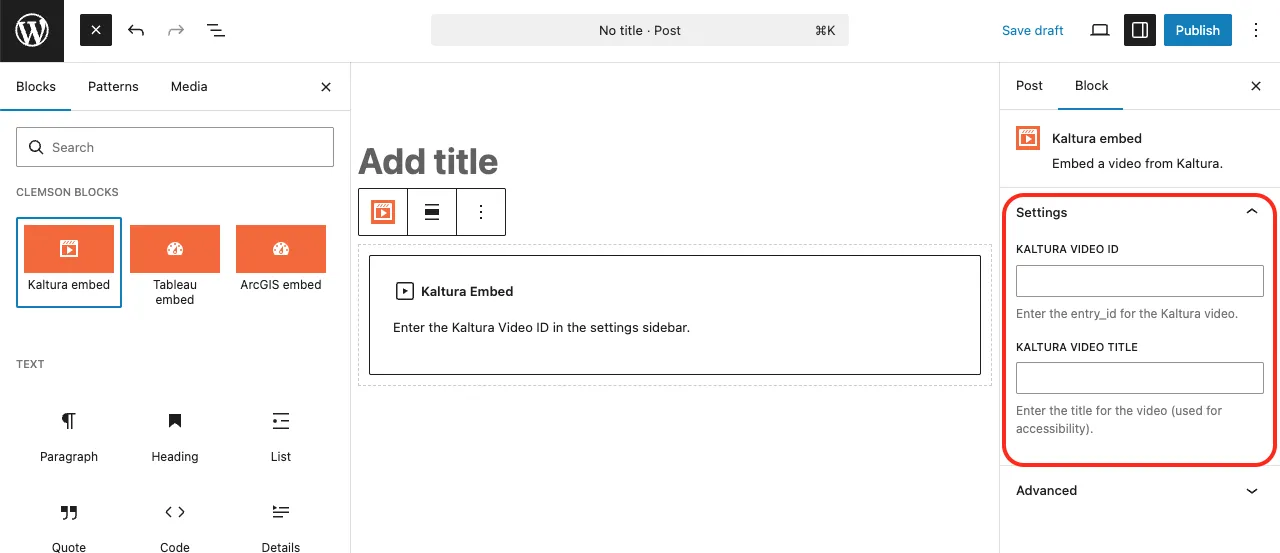
Kaltura Video Embed
Step 1: Click the Kaltura Embed block.
Step 2: Enter the Kaltura Video ID.
Go to your Kaltura media library
Select your video
Click the Share tab
Copy the string at the end of the media page URL
Step 3: Enter the Kaltura Video Title (required for accessibility).
Tableau Dashboard Embed
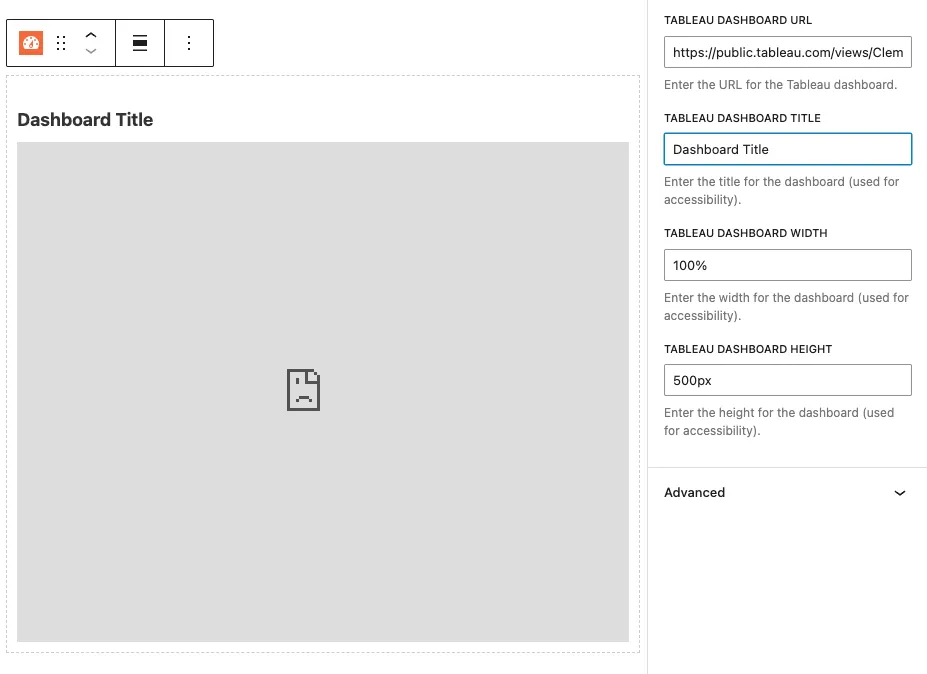
Step 1: Enter the Tableau Dashboard URL.
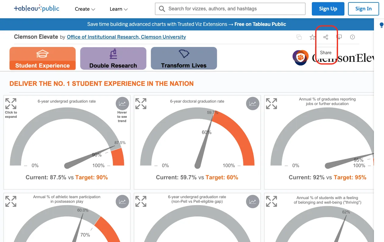
Open a public Tableau dashboard
Click the Share button
Click Copy Link
Step 2: Fill out the remaining fields:
Dashboard Title (required for accessibility)
Width
Height
Note: Tableau dashboards will not display inside the WordPress editor due to browser security restrictions:
Refused to display 'https://public.tableau.com/' in a frame because it set 'X-Frame-Options' to 'sameorigin'.
This is expected behavior. The dashboard will display correctly in preview and after publishing.
ArcGIS Experience Dashboard Embed
Step 1: Enter the ArcGIS Experience Dashboard URL.
Open a public ArcGIS Experience dashboard
Copy the URL from your browser’s address bar
Step 2: Fill out the remaining fields:
Dashboard Title (required for accessibility)
Width
Height
Summary
These custom blocks make it easy to safely embed external content while staying within WordPress security guidelines. Always include descriptive titles for accessibility and preview your post to confirm everything displays correctly.
We have added the “Blog Feed” feature to cascade. It can be added as a module in a new row, or added as a column widget in columns 6 cells or wider. Please follow the steps below to add to your page.
Select Blog Feed from the module selector or Widget Display list.
Fill in the name of the blog. This is the exact name in your url. For Example: “ows” in https://blogs.clemson.edu/ows/
Enter a numerical count of the amount of stories you wish to be displayed. Example: 1, 2, 5, 10, etc
Choose the blog format type. Default is “Basic Blog (No Images)”. This will not display any images. Posts with featured images will display a thumbnail image next to the listing if “Basic Blog (Display Images)” is chosen. The third option is a a standard list structure only showing and linking the titles of each post.
If applicable, fill in any categories. If multiple, separate by a comma.
If applicable, fill in any tags. If multiple, separate by a comma.
The new contact module is ready to implement on your pages.
**Remember, if you have used the module previously, you will have to update your pages to this new setup.
Navigate to your widgets folder, then click “Add Content” in the top nav
Navigate to Components > Widget.
Select “Contact Module” from the widget type.
Enter your desired data into the provided fields.
These are the same fields in the previous set up, but your data will not be preserved from the previous setup.
Recent updates to these fields were the abilities to toggle having either a custom link or a website contact and toggling on or off the social links.
Save and Publish your new widget
Next, navigate to your page and click “Edit”
Scroll down towards the bottom of the editor window, and you will see a new group labeled “Widget Module Area”. See attached screenshot.
Select Yes to display the area.
Choose the recently made widget from the widget chooser.
Repeat steps 6-9 per page as necessary.
Publish your page/s.
Once your page has this setup published once, publishing all your pages will not be required for each update. you will only need to edit and publish the widget for it to reflect updates across all the pages!
Only the Contact module widget will work here, the other widget types will not display here and only will display in the left column. And vise versa. The contact module widget will not display in the left column. Warning messages will display on your page if you accidentally assign the wrong widget type to an area.
We hope you guys find this new addition helpful, useful, and easy to implement. Please reach out with any questions, concerns, or issues.
It is important to use headings to structuring a page into sections and provide the user with an idea of what content will follow.
They are even more important for blind and vision impaired users as they allow content to be easily navigated – this means using heading levels rather than styling text with large or bold fonts. Headings are also good for search engine ranking.
Organise your content into sections.
Ensure that each section of content is identified by a heading.
Ensure that each heading describes and identifies its section of content.
Keep headings short and succinct.
Ensure headings are properly nested within each section of the document. For example, a Heading 2 must follow a Heading 1; a Heading 3 must following a Heading 2 and so on within each section.
Mark headings using HTML heading elements <h1> … <h6>. Increasing text size or using styles (e.g. emphasis or strong emphasis) is not the same as using heading elements.
Avoid use of abbreviations and jargon in headings.
“Click here” and “read more” links should be updated immediately! Link text should be meaningful and make sense out of context. It should describe the purpose of a link and if linking to a download, also include the file type and file size, especially when it’s a large file that will require time to download.
The best approach is to write link text that describes the purpose of the link without the help of surrounding text wherever possible (level AAA requirement). Otherwise, write link text that describes the purposes of the link with surrounding elements and including the information needed to clarify the link before the link.
Ensure link text is as short and concise as possible.
Avoid using “click here” or “read more” or any other phrases that are ambiguous or unclear. Also avoid using URLs for link text.
For links to email addresses, use the email address as the link text.
For links to documents and files, include the file type (e.g. PDF, Word) and the file size within the link text.
Meaningful links improves search engine ranking.
Ensure that links to the same location have are referred to consistently, or use the same link text.
Ensure that links to different locations do not use the same link text.
Have you ever wanted to add some colorful elements to your web page text? Sure, you can just change the text color but what if you want to take it up a notch and really make your text stand out? Panels and borders can be used to draw attention to special or important content. Simply add the class panel or border to your element, or to a div wrapped around many elements. Customize by also adding a brand color.
Browsershots is a free service that tests your Web design in different Web browsers. The resulting screen shots will allow Web designers to make changes and correct any problems with their site.
How Browsershots Works
Browsershots takes screenshots of your Web site the way it looks when viewed in a variety of Web browsers. When you submit your Web address, it will be added to the job queue. A number of distributed computers will open your Web site in their browser. Then they will make screenshots and upload them to Browsershots.