We’d like to share a couple recent updates the the video player in your Cascade templates. These updates provide a little more flexibility and accessibility for the video elements.
You can drop the controls below the player if you have the space and need that section of the video for captions, etc.
You can hide volume controls if the video has no volume.
Below you can see some example code that will output your video in these sweet new ways.
As the new templates age and we approach the end of the
content migration process, our team has been listening to feedback and keeping
an eye on how the templates are being implemented and performing. With this redesign,
our goal has been to take a proactive approach to making incremental changes
that address feedback from users and contributors as well as performance.
Through this we hope to constantly improve and update the website rather than
go through a full-scale redesign every 10-15 years as we have in the past.
As part of our most recent update some of the default sizing
for typographic elements such as paragraphs, headings, and lists have been
adjusted to reflect a more proportionally consistent sense of scale and spacing
between elements. Scale and proportion were also considered in the initial
design, but with this update, a mathematical approach to the values was used to
bring them into more precise and cohesive proportion.
These changes mainly targeted the basic instances of these
type elements and may not reflect in some of the modules, widgets, and menus.
We will be taking a look at the performance and functionality of each of the
modules and widgets in the near future and more changes to typography would
coincide with that update.
Detailed below are the main changes from the March 8th
update.
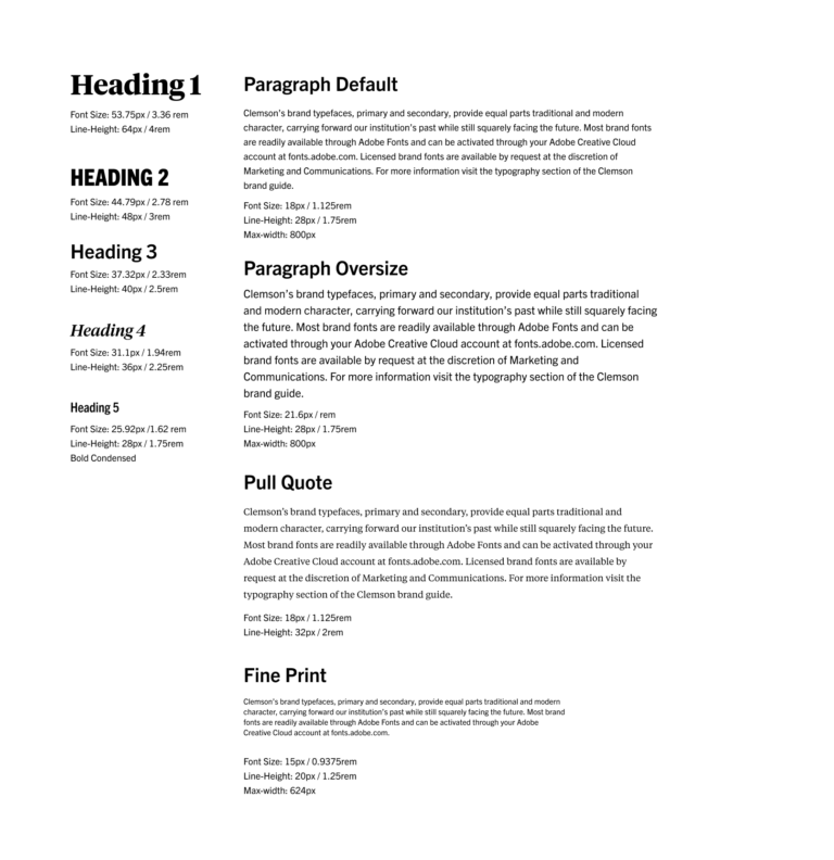
Updates to Default Heading and Paragraph Values
The mathematical basis of these changes start with an update to the default paragraph size from 16px to 18px. This change increases the legibility of our more detailed and lengthy copy and takes advantage of the generous amount of space the larger content area these templates allow. From there this 18px value was used with the minor third typescale(x1.2) to generate incrementally larger and smaller values for the rest of the basic web typographic elements. From here resizing to mobile was as simple as taking each level down one size in the scale.
This is an example of the old font sizes in a Figma design file. See tables below for sizing information.
This is an example of the old font sizes in a Figma design file. See tables below for sizing information.
Addition of max-width value to paragraphs
With this update, a max-width value of 800px was added globally to paragraph tags and lists to help curb unintentional instances of copy that run across the entire width of a page. The ideal line length for legibility is within 45-85 characters, and this update will bring copy closer to those values if they were not originally put into appropriately sized columns. This value was also adjusted to accommodate for some edge cases such as when an image element is contained within a paragraph. While these changes will help, please continue to be mindful of column layout choices to maximize use of space and legibility when building pages.
Moving towards a consistent 8px grid for layouts
Moving towards a consistent 8px grid for layouts
As we continue to revisit the UI elements of the new
template, we are seeking to adjust specific sizes of elements to adhere to a
standardized 8 pixel grid format. Along
with the font size adjustments, the line-heights for the different type
elements may have been tweaked to begin moving towards a standard grid layout
for Clemson.edu. These changes will add more consistency to sizing and spacing across
the site and ease of design and development in the future.
If you’re interested in learning more, here a few good
articles that explain further about using grids for UI design.
Updates to Twitter Icon and the Custom Clemson Fonts
This update also adds a few updates and additions to the Clemson custom icon font. The biggest being the change to the twitter icon to reflect their updated brand. For widgets that add icons automatically through the cascade backend such as the contact widgets and modules, you may have to republish the include files themselves for changes to take effect. For instances where the icon was added manually to HTML or in the content modules of the cascade templates like image and icon buttons, the new classes to use are “clemson-icon clemson-twitter-x” instead of “lab la-twitter”.
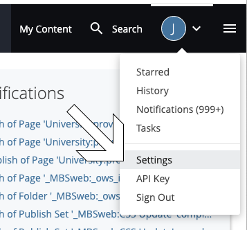
Attention Cascade users! It seems that Cascade recently made a change to the default setting for displaying asset names. If you prefer to see file names instead of titles or display names (which you should!), you’ll need to make a quick adjustment.
Here’s how you can revert to displaying file names:
Click on the user menu dropdown located at the top right corner of your screen.
In the dropdown menu, select “Settings” from the list.
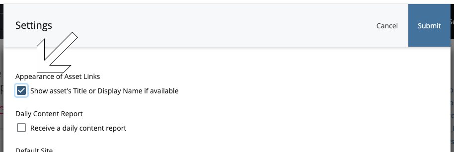
In the Settings menu, look for the checkbox labeled “Show asset’s Title or Display Name if available.” Make sure it is unchecked.
Once you’ve unchecked the box, click “Submit”.
That’s it! You’ve successfully reverted to displaying file names instead of titles or display names for your assets in Cascade.
If you ever wish to switch back to displaying titles or display names, you can revisit your settings and re-enable the option at any time. We don’t recommend that!
As described in step 1 aboveAs described in step 3 above
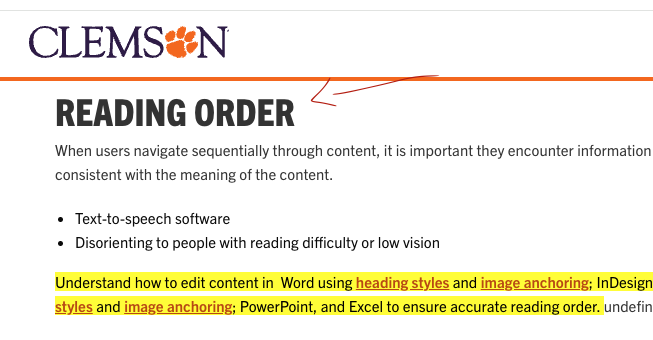
Attention web editors working in Cascade templates: here’s a quick tip to improve user experience.
If you’ve encountered issues with anchor tags scrolling under fixed headers, worry no more. With the .anchor-space class, you can easily add some top space to your anchor tags, ensuring they can still be in the viewport even with fixed header in place.
Simply apply the .anchor-space class to your anchor tags. No more content hidden under fixed header. This should clear up some user confusion.
Check out the example below:
<h2>
  <a id="reading-order" class="anchor-space"></a>
  Reading Order
</h2>
This is still dev-only but will soon be pushed to production.
With the rebrand and launch of the new Clemson News we are making a few changes to the news feeds workflow in order to serve up the best user experience across sites. Below are the details on the philosophy behind the new workflow and how you can incorporate Clemson News into your redesign project.
Organization
There are some organizational changes on the Clemson News site that will affect how feeds are pulled into Cascade. Clemson News uses three primary taxonomies to achieve the new organization: Categories, Tags, and External Site Feeds. (Need to find out more about taxonomies? See the explanation on wordpress.org.)
New Taxonomy: Clemson News administrators created a new taxonomy called “External Site Feeds” that can be applied to stories that should be pulled onto the main pages for college/divisions. This new taxonomy is primarily used for main pages, for example college/division homepages, and the main landing pages in the .edu site.
Categories and tags will continue to be used for departmental feeds. Be aware that some categories and tags have been recently changed so you will want to utilize the new parameter builder tool I show you below.
This new taxonomy allows communicators in Clemson News to control what stories funnel to the main .edu website and which should remain only available on the Clemson News site.
Each category on the Clemson News site has a customizable landing page that houses any post in that category. The communications team also heard multiple requests for a way to keep certain stories from being pushed to the main website and the External Site Feeds taxonomy does just that.
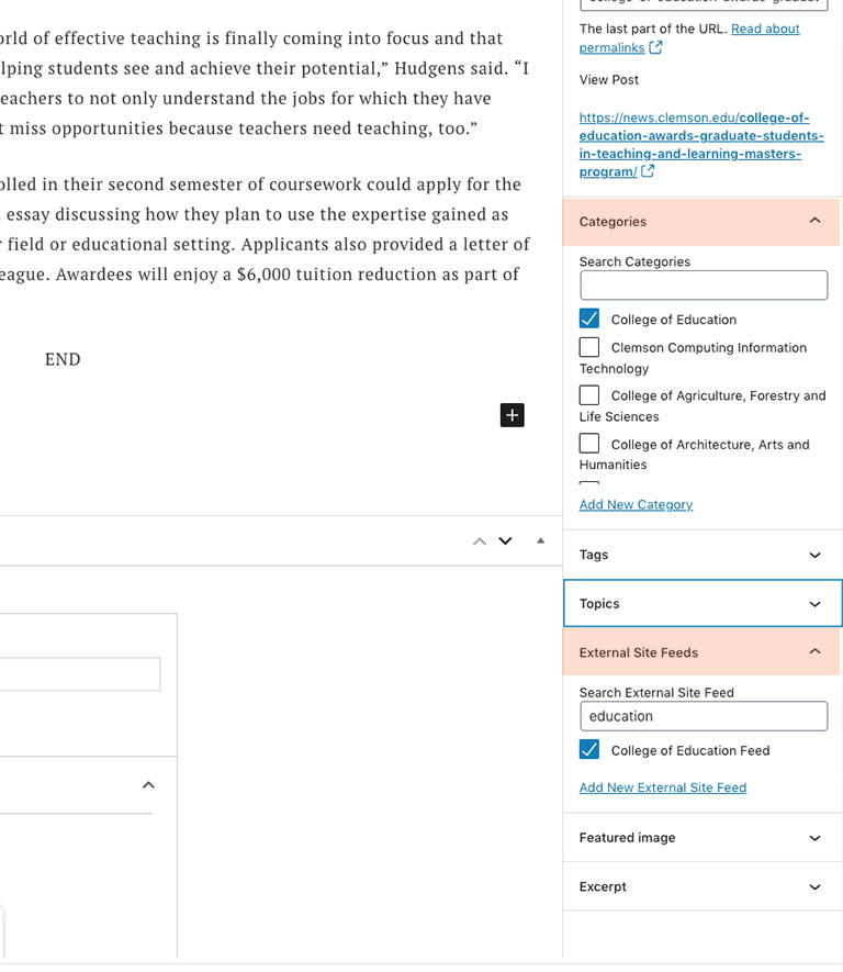
This is the archive landing page for the College of Education on the Clemson News site. All stories with the College of Education category will be shown on this page.
For example, if someone in the College of Education has a story they’d like to push to both the Clemson website and the College landing page in Clemson News she would need to apply both the Category and External Site Feeds selection of “College of Education”.
The Categories taxonomy puts this post on the archive landing page in Clemson News. The External Site Feed pushes this post to the feed on the College of Education’s homepage.
Generating the feed
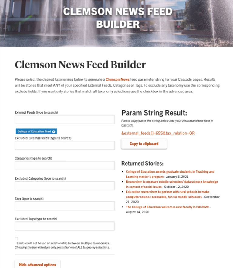
We have an updated parameter builder tool for web editors to pull Clemson News feeds into their sites in Cascade. To get the feed into Cascade just make the taxonomy selections to filter Clemson News content to your specific needs, copy the param string result, and paste that into the News widget in the Cascade editor. Once the page is published it will pull the appropriate stories into the feed on your page.
The parameter builder tool provides easy, granular filtering for Clemson News content.
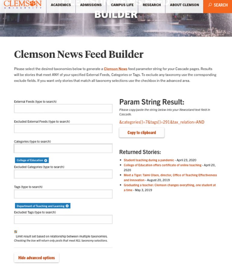
For a college homepage it may be best to utilize just the external site feed taxonomy, but the builder tool allows you to customize the filter to give them just the feed you need. In the example below the feed has been filtered to show just stories tagged Department of Teaching and Learning in the College of Education category.
Departments are in the tag taxonomy in Clemson news. Colleges are in both category and external site feed taxonomies. Combining these taxonomies and their relationships gives web editors a lot of control over their Clemson News feeds.
We previously did not have some default color theming set on particular widgets, modules, and buttons. The default color if no color is selected should now be Diploma. Please let us know if anything different is discovered.
After much discussion and feedback, we will be removing the Intro Section area on the RedesignCollege Landing Page Templates.
We will be allowing till next Monday (23rd) to move any content previously input into this section into another content module of your choosing. Once we remove this from the data definition, your content will be lost from here. The intro section will remain on the Department Landing Page Templates.
The Interior template hero images/banners were originally designed to be more of a “masthead”, to be consistent throughout parts of a site. This is why we have the image for this section set in the options block. We have had many questions regarding some custom edits to the titles/image, which are limited here to keep this consistency across all interior pages within a folder or sub-site where a new options block is set. Previously we had an option to set the title to be either current folder’s display name OR the parent folder’s display name. This was causing some issues with multiple level items that were not intended to be sub-sites.
The Fix:
We have updated the way the titles are targeted for display. There is no longer a radio button selection for this in the options block. The titles in these banners/mastheads for interior pages are now targeted by the closest option block’s current folder. This title will trickle down throughout any sub items using the interior page template, until a folder is reached with a new options block. Any pages in that new level (along with the new options block) and deeper levels will have the new display name from the new option block’s current folder. This may be confusing to some. I will try to map it out below – in hopes i do not confuse any further. Please let me know if you have any questions.
For example:
/example-site-folder/ – has the display name – Example Site Folder.
/example-site-folder/options – options block is set here to get above display name on all interior pages
/example-site-folder/interior-page.html – display name displayed in masthead/banner – Example Site Folder
/example-site-folder/subfolder/interior-page.html – display name displayed in masthead/banner – Example Site Folder
/example-site-folder/subfolder/another-sub-folder/ – has display name – Another sub folder
/example-site-folder/subfolder/another-sub-folder/options – options block is set here to get above display name for /another-sub-folder on all interior pages from here on out
/example-site-folder/subfolder/another-sub-folder/interior-page.html – display name displayed in masthead/banner – Another sub folder
Next Steps:
Publish any interior pages using the interior page template in your redesign site to catch this update.
If you have not noticed by now, the updated Secondary Navigation is now available in the new redesign templates
** You will need to republish any and all sn-config files you may have in your redesign site to grab the updated structure.
A couple notes on this.
We have extended the navigation to 3 levels instead of just 2.
There is no limit on the amount of items in the 2nd or 3rd sublevels of the menu. HOWEVER, please be mindful of how long your menus get vertically filled with navigation items in regards to forcing users to have to scroll down to view the whole sub menu on smaller laptop screens. We are hoping that providing this extra level will allow everyone to take a second look at their site hierarchy and organize their material into a user friendly experience.
A sub menu only kicks in if there are pages/folders (besides an index, sn-config, and options block) set to display in the nav, within the main folder at hand,
The new structure removes having main level items as buttons, which forced these to be links in the submenu. A menu item that has a submenu now is directly linkable from that primary level it is on, no more need for duplicate text. A separate button still remains with only the Arrow within. This is left for accessibility purposes/functionality.
Link text uses the Display Name field in the meta area of a page. There is a 70 characters limit on the nav item link text. This is NOT enforced on the Display Name field itself when entering text, but enforced on publish. PLEASE be mindful of this. If you Display Name is longer than 70 characters, it will get chopped. This limit should allow, still, a solid length of text, and keep your link text to no more than 3 lines.
Please publish, test your navigation, and let me know if you experience any issues or have any concerns.
We have added the “Blog Feed” feature to cascade. It can be added as a module in a new row, or added as a column widget in columns 6 cells or wider. Please follow the steps below to add to your page.
Select Blog Feed from the module selector or Widget Display list.
Fill in the name of the blog. This is the exact name in your url. For Example: “ows” in https://blogs.clemson.edu/ows/
Enter a numerical count of the amount of stories you wish to be displayed. Example: 1, 2, 5, 10, etc
Choose the blog format type. Default is “Basic Blog (No Images)”. This will not display any images. Posts with featured images will display a thumbnail image next to the listing if “Basic Blog (Display Images)” is chosen. The third option is a a standard list structure only showing and linking the titles of each post.
If applicable, fill in any categories. If multiple, separate by a comma.
If applicable, fill in any tags. If multiple, separate by a comma.