To help support commonly requested embeds that are not allowed directly in blogs.clemson.edu sites due to network blog security settings, we’ve created three custom blocks for you to use. These restrictions are related to WordPress roles and capabilities (such as unfiltered_html), which limit iframe usage in standard editors. You can read a bit more about unfiltered_html permissions here: https://wordpress.org/documentation/article/roles-and-capabilities/#unfiltered_html
Let’s get to it!
You can find these blocks in the “Clemson Blocks” category within the block editor.
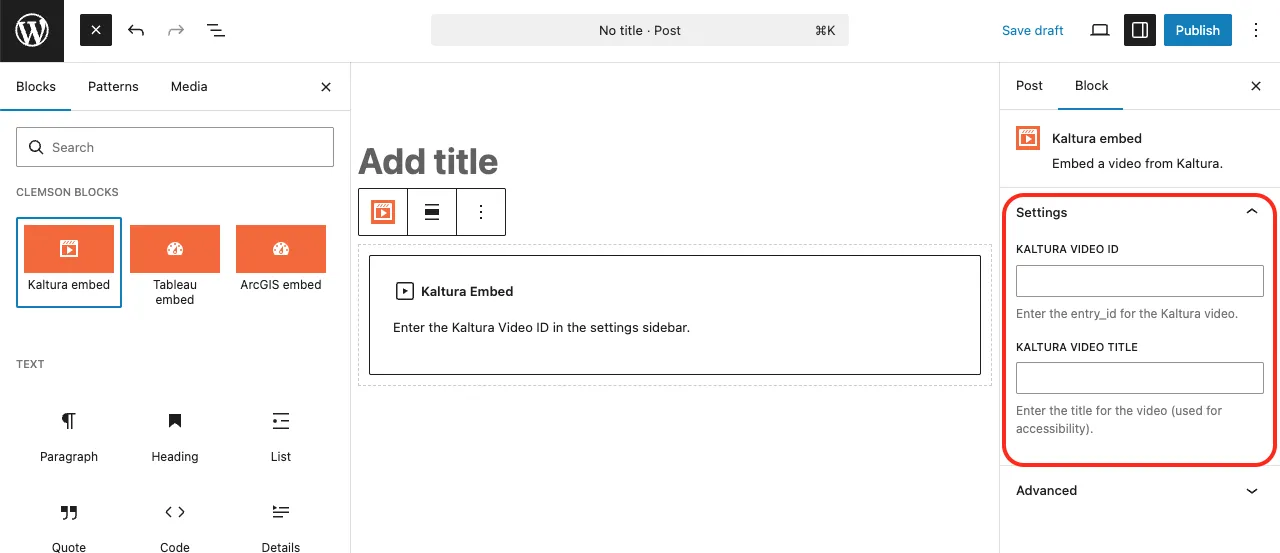
Kaltura Video Embed
Step 1: Click the Kaltura Embed block.
Step 2: Enter the Kaltura Video ID.
Go to your Kaltura media library
Select your video
Click the Share tab
Copy the string at the end of the media page URL
Step 3: Enter the Kaltura Video Title (required for accessibility).
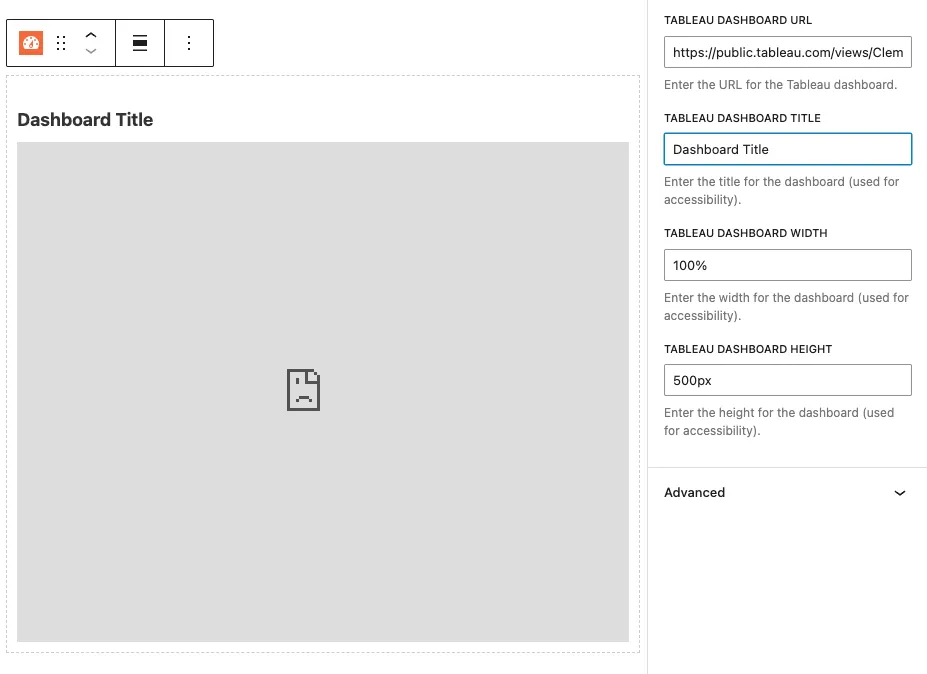
Tableau Dashboard Embed
Step 1: Enter the Tableau Dashboard URL.
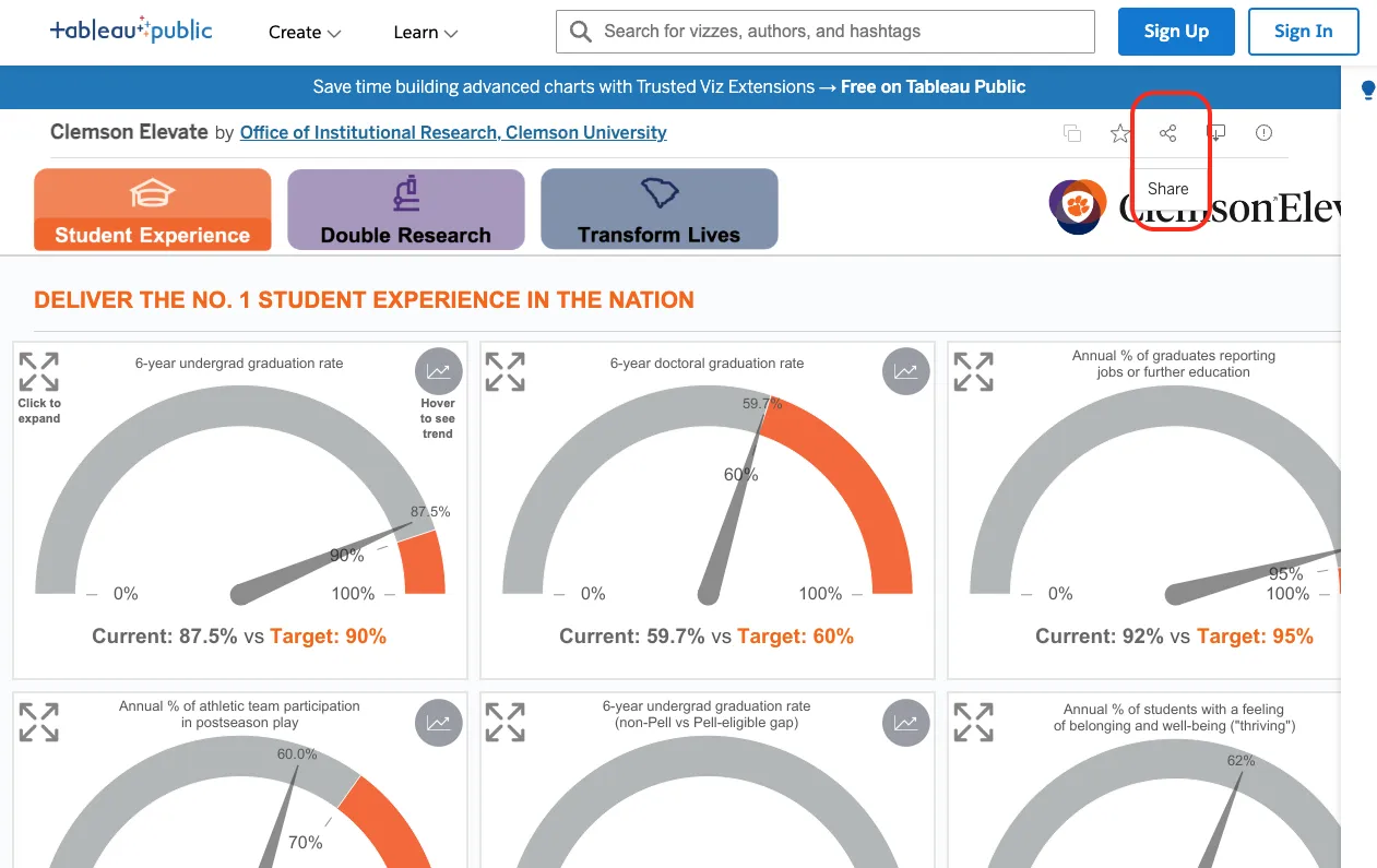
Open a public Tableau dashboard
Click the Share button
Click Copy Link
Step 2: Fill out the remaining fields:
Dashboard Title (required for accessibility)
Width
Height
Note: Tableau dashboards will not display inside the WordPress editor due to browser security restrictions:
Refused to display 'https://public.tableau.com/' in a frame because it set 'X-Frame-Options' to 'sameorigin'.
This is expected behavior. The dashboard will display correctly in preview and after publishing.
ArcGIS Experience Dashboard Embed
Step 1: Enter the ArcGIS Experience Dashboard URL.
Open a public ArcGIS Experience dashboard
Copy the URL from your browser’s address bar
Step 2: Fill out the remaining fields:
Dashboard Title (required for accessibility)
Width
Height
Summary
These custom blocks make it easy to safely embed external content while staying within WordPress security guidelines. Always include descriptive titles for accessibility and preview your post to confirm everything displays correctly.
Attention Cascade users! It seems that Cascade recently made a change to the default setting for displaying asset names. If you prefer to see file names instead of titles or display names (which you should!), you’ll need to make a quick adjustment.
Here’s how you can revert to displaying file names:
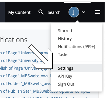
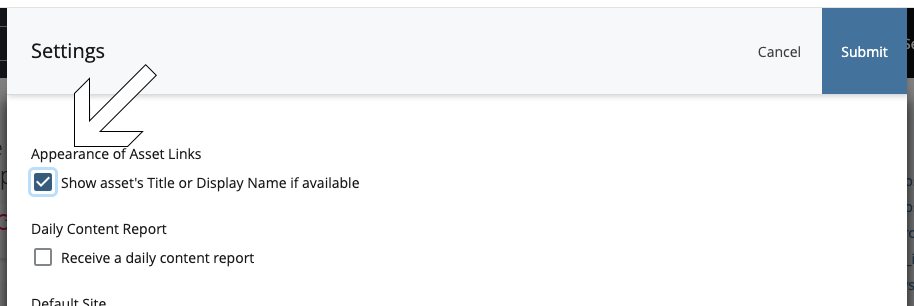
Click on the user menu dropdown located at the top right corner of your screen.
In the dropdown menu, select “Settings” from the list.
In the Settings menu, look for the checkbox labeled “Show asset’s Title or Display Name if available.” Make sure it is unchecked.
Once you’ve unchecked the box, click “Submit”.
That’s it! You’ve successfully reverted to displaying file names instead of titles or display names for your assets in Cascade.
If you ever wish to switch back to displaying titles or display names, you can revisit your settings and re-enable the option at any time. We don’t recommend that!
As described in step 1 aboveAs described in step 3 above
We found a situation where a user may copy a folder from an old site. This is great in helping get your content over, but will not give you the proper meta data on the folder. To combat this, please create all folders from your new redesign site and copy any potential files like images into the newly created folder to ensure the proper meta data is there. This meta data is needed to help build the navigation.
I wanted to make everyone aware of a recent update to the Interior Page Template Hero Image. We were brought aware of the idea that it could be difficult to find that many images for each interior page. These interior page banner images were originally meant to be more of a “masthead” for the page and be consistent throughout each of your folders/sections/departments of your site. This is why we have made the switch to set this on the folder level instead of per page. You will still set images on landing page templates, this only affects Interior Pages.
Prior:
The Hero Banner Image was set per page
Now:
The Hero Banner Image is set in the options block
**NOTE: Any built interior pages prior to this email will not carry over the set image. Please update your options block with your desired banner image to reflect the change and republish any interior pages to reflect the update.
Choosing appropriate text alternatives:
Imagine that you’re reading the web page aloud over the phone to someone who needs to understand the page. This should help you decide what (if any) information or function the images have. If they appear to have no informative value and aren’t links or buttons, it’s probably safe to treat them as decorative.Decorative images don’t add information to the content of a page. For example, the information provided by the image might already be given using adjacent text, or the image might be included to make the website more visually attractive.In these cases, a null (empty) alt text should be provided (alt="") so that they can be ignored by assistive technologies, such as screen readers. Text values for these types of images would add audible clutter to screen reader output or could distract users if the topic is different from that in adjacent text. Leaving out the alt attribute is also not an option because when it is not provided, some screen readers will announce the file name of the image instead.
Prioritize information in text alternative:
Aim to put the most important information at the beginning. Include “Clemson University, Clemson South Carolina” in the alt tag for SEO purposes.
Length of the text alternative:
The alt text should be the most concise description possible of the image’s purpose. If anything more than a short phrase or sentence is needed, it would be better to use one of the long description methods.Complex images contain substantial information using long description methods are typically:
graphs and charts, including flow charts and organizational charts;
diagrams and illustrations where the page text relies on the user being able to understand the image;
maps showing locations or other information such as weather systems.
In these cases, a two-part text alternative is required. The first part is the short description to identify the image and, where appropriate, indicate the location of the long description. The second part is the long description – a textual representation of the essential information conveyed by the image. Remember that complex images can be difficult to understand by many people – in particular people with learning disabilities and people with low vision. Long descriptions benefit many people, and it is good practice to make them available to everyone, for example, as part of the main content. It may also be possible to reduce unnecessary complexity in your images and make them easier to understand for everyone.
It is also good practice to refer to and summarize more complex images from the accompanying text. For example, a reference such as “The following graph shows that visitors were lost in the first quarter, but the numbers recovered in the second quarter” helps to point out the relevant information that the image is intended to present.
Punctuation within alt attributes:
As for any text, using punctuation in the text alternative makes the information easier to understand. In particular, remember to add space characters in the alt text when there’s no space character between the image and adjacent text, to avoid having words running together when they are read by a screen reader.
If you use a null (empty) text alternative (alt="") to hide decorative images, make sure that there is no space character in between the quotes. If a space character is present, the image may not be effectively hidden from assistive technologies. For instance, some screen readers will still announce the presence of an image if a space character is put between the quotes.
Superfluous information in the text alternative:
Usually, there’s no need to include words like “image”, “icon”, or “picture” in the alt text. People who can see will know this already, and screen readers announce the presence of an image. In some situations, it may be important to distinguish between paintings, photographs, or illustrations, etc., but it’s best to avoid the more generic use of the terms.
SVG graphics: Scalable Vector Graphics (SVG) is an XML-based vector image format for two-dimensional graphics with support for interactivity and animation. The SVG specification is an open standarddeveloped by the World Wide Web Consortium (W3C) since 1999.SVG images and their behaviors are defined in XML text files. This means that they can be searched, indexed, scripted, and compressed. As XML files, SVG images can be created and edited with any text editor, as well as with drawing software.All major modern web browsers—including Mozilla Firefox, Internet Explorer, Google Chrome, Opera, Safari, and Microsoft Edge—have SVG rendering support.
SVG graphics can be referenced in the src attribute of an <img> element like other image formats (PNG, JPEG, GIF).
As SVG images consist of tags like HTML, their code can also be used in HTML5 directly. In this case you can provide a text alternative in a <title> element within the SVG image. To improve accessibility support, that title should be referenced from an aria-labelledby attribute of the <svg> element, for example:<svg aria-labelledby="svgtitle1"> <title id="svgtitle1">Settings</title> [other svg code] </svg>
Logos:
Logo images with text are exempt from some of the accessibility requirements. For instance, there is no minimum contrast requirement.
Keep it simple: Complex tables are more work for content creators as well as being harder to interpret for users. It’s usually better to break up complex tables into simple individual tables, each containing the data for one sub-topic. Multiple simple tables can provide the same information as the mutli-level table but it makes the information easier to understand for everyone and easier to code. Also, simple tables are much better supported by tools to create web content, including WYSIWYG (“What you see is what you get”) editors.
Table separation: If several tables follow one another, don’t use a single table and put in an additional row of <th> cells. Screen readers may read aloud all <th> cells in a column, resulting in confusion. Start a new <table> when the topic changes.
Data separation:
Make sure that each separate piece of data has its cell. Don’t use headers in one column and all data in a second column, as this will make it almost impossible for screen readers to work out the relationships between data across columns.
Don’t use line breaks (<br> elements) to create table rows as the data in the pseudo-rows may no longer align correctly when text is resized.
Alignment: Align text to the left and numeric data to the right (in left-to-right languages), so that people using larger text sizes or smaller screens will be able to find it. This is especially useful if a cell spans more than one column. It’s helpful to give column headers the same alignment as the data in the cells below.
Styling header cells:<th> elements are used for header cells, using <td> elements with different styling will make tables less accessible if not inaccessible. It is also helpful to differentiate <th> and <td> cells visually.
Zebra tables: Styling even and odd rows in a different way can be helpful to people who have reading difficulties or who enlarge text. It acts as a visual guide. Highlighting the cell (and row/column) on mouseover and keyboard focus to support people to see where they are. Make sure that the contrast ratio between the text and background is good for both headers and data cells. The contrast between all text and its background is at least 4.5:1 for normal-size text.
Flexibility: Due to the layout model of tables, they sometimes don’t fit on small screens small or are too wide if the user is zooming in. In such circumstances, it’s important that the table isn’t cut off (for example by using overflow: hidden in CSS).
Tables for Layout: Tables should not be used for layout purposes. Use Cascading Style Sheets (CSS) for layout. If there are already layout tables present, don’t use structural elements (like <th> or <caption>), and do add role="presentation" to the <table> element.
Captions and summaries provide information that can help users find, navigate, and understand tables. While they are not required in every case to meet WCAG 2.0, captions and summaries are fairly straightforward ways to provide such information that is often needed.
A caption functions like a heading for a table. Most screen readers announce the content of captions. Captions help users to find a table and understand what it’s about and decide if they want to read it. If the user uses “Tables Mode”, captions are the primary mechanism to identify tables. The caption is provided by the <caption> element.
A summary conveys information about the organization of the data in a table and helps users navigate it. For example, if a table has an unusual structure (as in the examples below), information about what content can be found in which row or column can be provided to the user. A summary is usually only needed for complex tables.
If both caption and summary are provided for one table, the summary should not duplicate information present in the caption.
It is important to use headings to structuring a page into sections and provide the user with an idea of what content will follow.
They are even more important for blind and vision impaired users as they allow content to be easily navigated – this means using heading levels rather than styling text with large or bold fonts. Headings are also good for search engine ranking.
Organise your content into sections.
Ensure that each section of content is identified by a heading.
Ensure that each heading describes and identifies its section of content.
Keep headings short and succinct.
Ensure headings are properly nested within each section of the document. For example, a Heading 2 must follow a Heading 1; a Heading 3 must following a Heading 2 and so on within each section.
Mark headings using HTML heading elements <h1> … <h6>. Increasing text size or using styles (e.g. emphasis or strong emphasis) is not the same as using heading elements.
Avoid use of abbreviations and jargon in headings.
“Click here” and “read more” links should be updated immediately! Link text should be meaningful and make sense out of context. It should describe the purpose of a link and if linking to a download, also include the file type and file size, especially when it’s a large file that will require time to download.
The best approach is to write link text that describes the purpose of the link without the help of surrounding text wherever possible (level AAA requirement). Otherwise, write link text that describes the purposes of the link with surrounding elements and including the information needed to clarify the link before the link.
Ensure link text is as short and concise as possible.
Avoid using “click here” or “read more” or any other phrases that are ambiguous or unclear. Also avoid using URLs for link text.
For links to email addresses, use the email address as the link text.
For links to documents and files, include the file type (e.g. PDF, Word) and the file size within the link text.
Meaningful links improves search engine ranking.
Ensure that links to the same location have are referred to consistently, or use the same link text.
Ensure that links to different locations do not use the same link text.